
How do you turn a company vision into a place people want to explore? That was the question behind the Noon-Iverse. Working with the brand agency Slater Design, I illustrated an isometric world floating in space for Around Noon, a food-to-go manufacturer in the UK and Ireland. Here is how it came together.
The brief: a company vision as a world
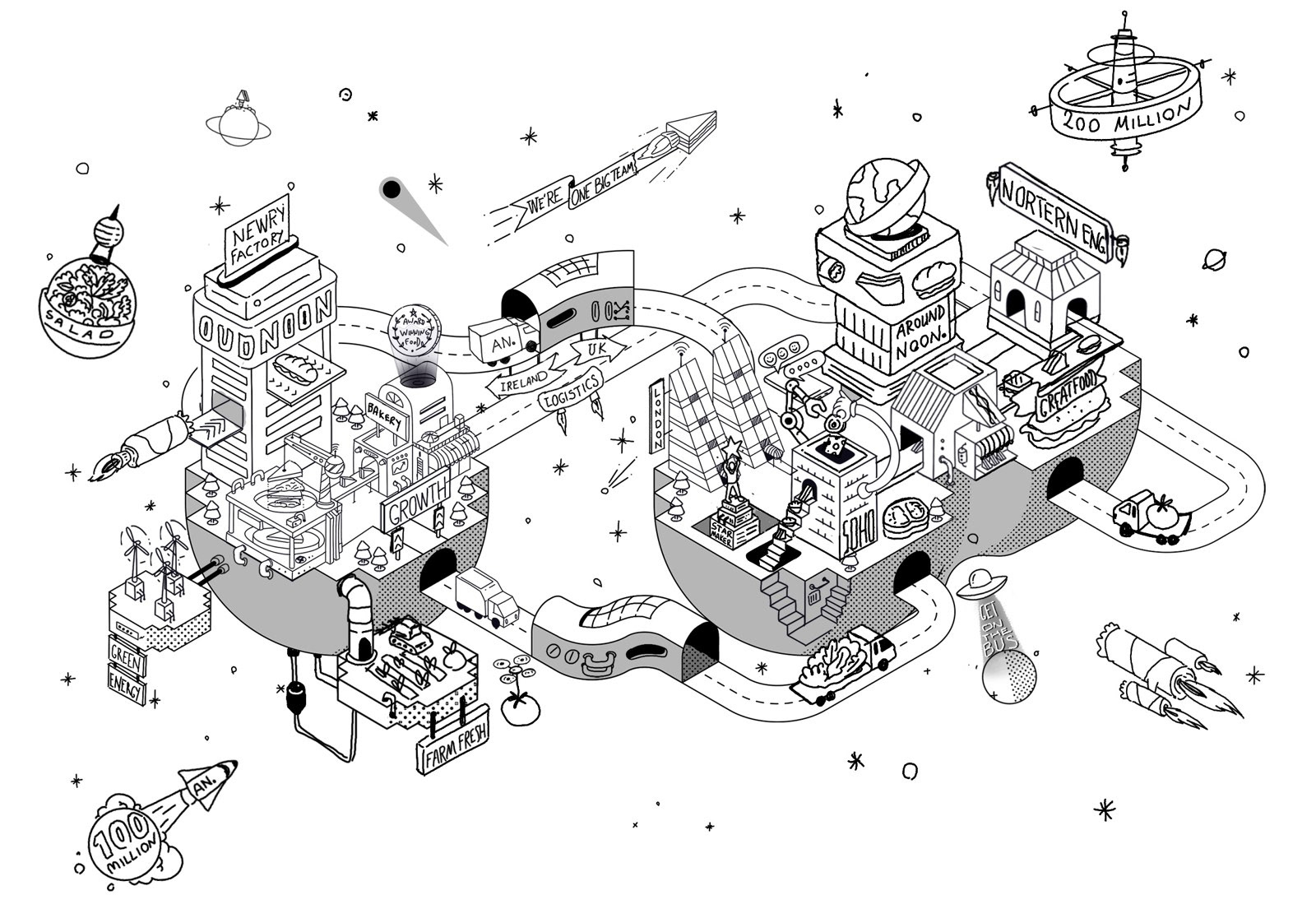
Around Noon wanted to show where they are heading by 2026 in a playful way. The brief asked for a space setting with planets and spaceships, the £200M sales target as the one number to focus on, and the company's values hiding in the landscape as buildings, billboards and props. Factories had to be real buildings. Everything else, from logistics to green energy, was open to interpretation. Slater asked for an isometric world, so I built the whole scene on one isometric grid.
Two planets, one loop
The brief suggested two planets, one for Ireland and one for the UK, with routes between them. I joined them into an infinity shape, so the roads run from one side to the other and back again. That also shows the hub-and-spoke logistics between the two countries. The £200M goal sits on a ring-shaped space station above the UK.
“I wanted the values to be things you can find, not words you read.”
From sketch to vector
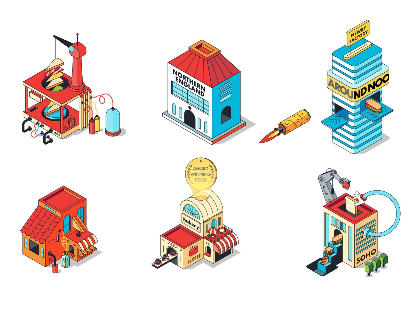
I started with a black-and-white sketch to lock the layout: the shape of the two planets, the route of the roads and where each building would stand. Then I drew every building and prop one by one in vector, so each piece also works on its own. The values became objects. “Be the star maker, not the star” became a statue holding up a star, “Get on the bus” became a UFO with a beam, and “One big team” and “Growth” became billboards.
Colour and light
For colour, I went with a dark space background fading into a warm red glow, pale blue roads, and cream, red and blue buildings. That keeps a very busy world readable and gives it the warm, ambitious feel the brief asked for.

Then I made it move
After the print was done, I turned the project into a looping animation. The crane, the delivery vans and the farm come to life, so the world keeps moving and growing, just like the company.
What I take from this
A brief full of values can easily turn into a poster full of words. Turning each value into a small object to find made the picture something people want to look at for a while. That is what I try to do in every illustration.
Recognition: longlisted in the World Illustration Awards 2025.
Client: Around Noon (UK), in collaboration with Slater Design.


