
How do you fit the entire city of Dublin onto an 8.5-meter wall? That was the question behind my latest mural. Working with Detail Design Studio in Dublin, I illustrated a full isometric city map for the new Dublin hub of a large fintech company.
The brief: a city guide on a wall
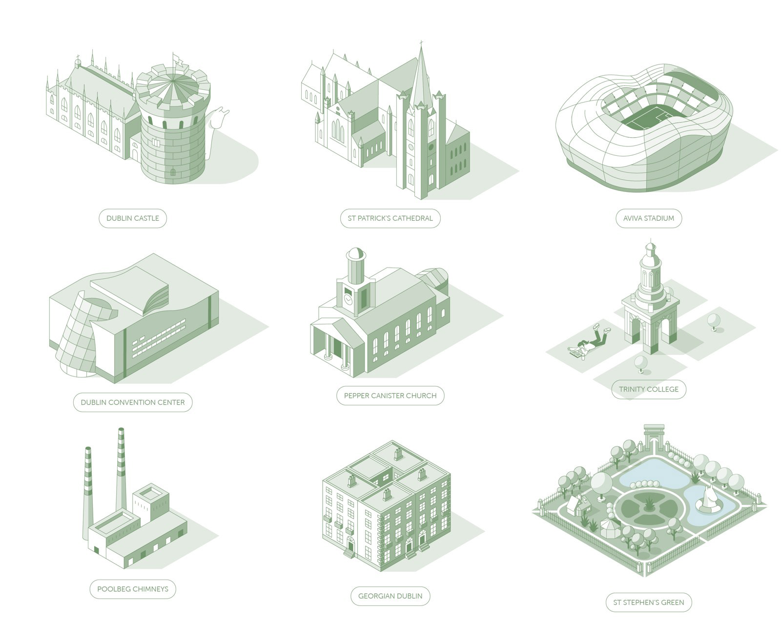
The client had seen my earlier isometric city work and liked its style. They wanted a big, fun map for the hub's training space, so people could explore and connect with Dublin. The style was clean, structured and detail-driven, made for a long horizontal wall of about 8.5 by 3 meters. The brief suggested landmarks like St Patrick's Cathedral, Dublin Castle, Trinity College and Aviva Stadium, but the final illustration did not have to be geographically correct.
Start with the grid
I could have moved to Dublin for three months, walked every street and sketched every pub. I didn't. The real work started with an isometric grid. I laid out the city on the long wall format, with the canal running through it, and chose a calm sage green as the main color. Once the rough layout was approved, I drew every building one by one.
“How do you fit a whole city onto an 8.5-meter wall?”
Characters bring the city to life
My favorite part was the characters: friends hanging out by the canal, people in pubs, street musicians, football fans, and yes, even James Joyce taking a stroll. I also hid llamas all over the city. How many can you spot?

On the wall
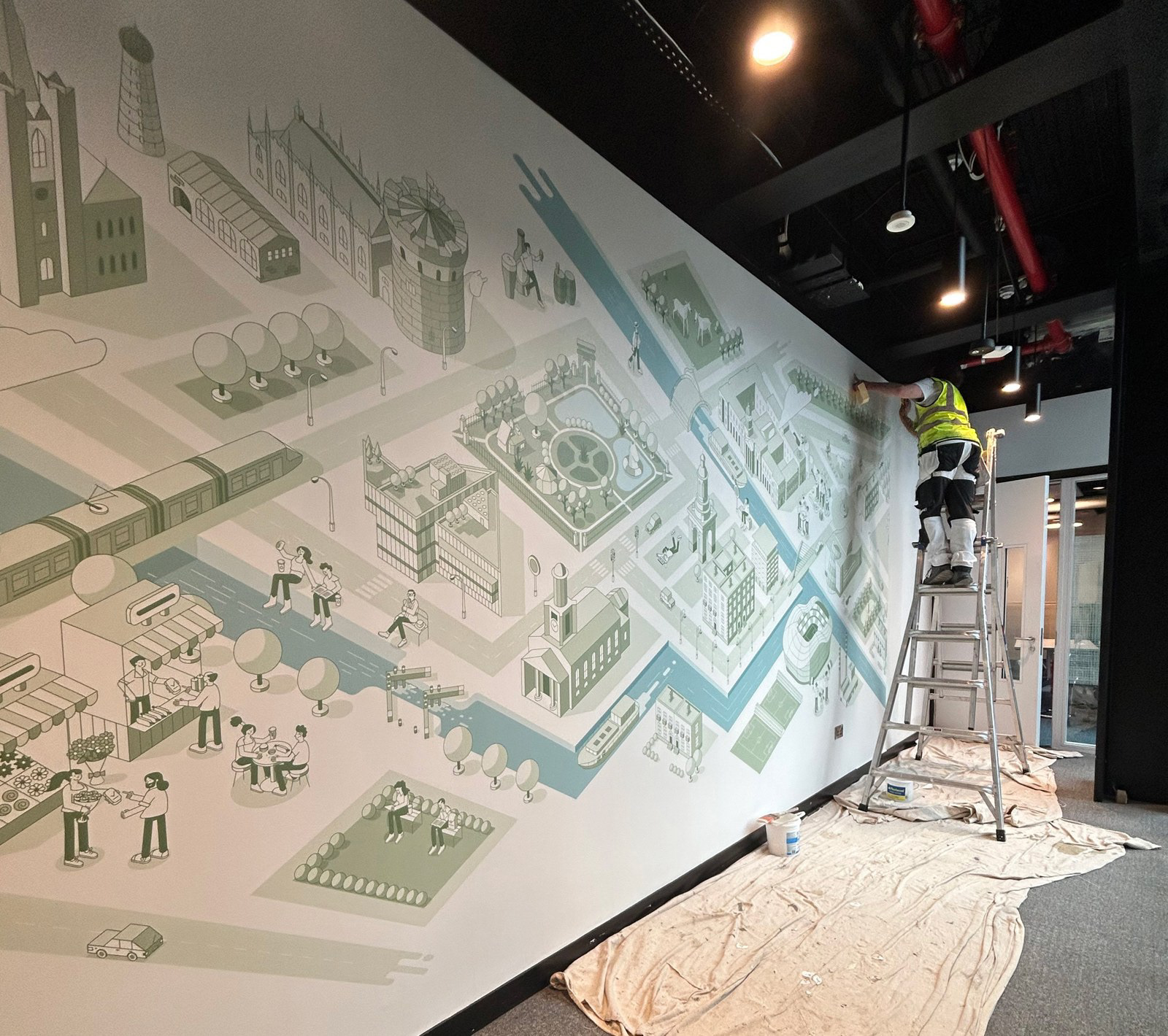
After weeks of work, the wall was complete. The sketches had become vector illustrations, piece by piece, and then a full mural for the hub.
What I take from this
A city map on a wall has to work from far away and up close. From a few meters away it should read as one clear city. Up close, people should find small stories to discover. That is the balance I tried to find.
Recognition: the mural was chosen by the jury for the Society of Illustrators 68th Annual and exhibited in New York.
Client: a large fintech company, in collaboration with Detail Design Studio (Dublin).


