
This year's most important project was with Cisco. Working with the creative agency Sans Serif, I designed the full venue map for GSX, Cisco's big sales event in Las Vegas. Here is how I turned a classic floor plan into an isometric world that people actually want to explore.
The brief: a map people want to use
Cisco wanted an interactive map that makes the event hub fun and easy to navigate. The challenge was simple to say and hard to solve. First-time attendees get lost in the size of the hub, veterans feel they have seen it all, and systems engineers want content made for them. The map had to help all three groups find their way, mark the new entrances clearly, and give every hub its own character.
The style direction was clean, minimal vector work in Cisco's brand colors, with no heavy textures or hand-drawn feel. Professional and sleek, with a touch of futuristic energy.
From floor plan to isometric world
I started with the floor plan and a stack of sketches on the iPad. My goal was to turn flat rectangles into places. In isometric view, every area can show what happens inside it, so people read the map like a story instead of a diagram. After the sketches, I built the base in Illustrator, using keylines to keep every hub aligned to the same isometric grid.
“I wanted the map to feel like a place, not a floor plan.”


16 unique hubs, one big story
Nobody told me what to draw for the hubs. I only got their names. So I studied each of the 16 hubs, worked out what it was really about, and came up with my own idea for each one. AI-Ready Data Centers became a tower of servers, and Digital Resilience became a shield with a keyhole.
Add the gamification landmark, the lounges, the theatres and the large GSX landmark at the main entrance, and every space got its own small story. I connected all 16 hubs with pathways, so the whole venue works as one big scene. Zooming in rewards you with small details. Zooming out shows the full venue at a glance.
Every hub has its own full illustration. You can see them all on the Cisco project page.
Characters and color
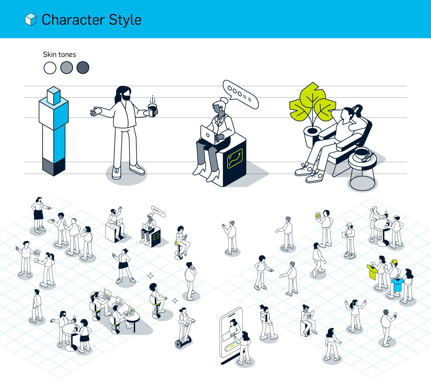
For the first round, I presented a style sheet with the isometric projection, the character design and the color palette. Midnight blue carries the outlines and dark areas, lime adds a fresh tech accent, and Cisco blue is used for lighter details. The characters are simple and stylized, with different skin tones, so they fit the Cisco look and stay readable at small sizes.
Built to change
Event layouts change, so I organized the files in labeled layers for zones, activities and icons, with editable text. I delivered the map as clean vector files, so it can be scaled and reused across web, mobile and print.
What I take from this
A good map is not only about drawing a lot of detail. It is about order: what you see first, where your eye goes next, and how easy it is to find your way. That is what I tried to solve with this project.
Client: Cisco, in collaboration with the creative agency Sans Serif (Oakland, California).